How to Create a Responsive WordPress Navigation Bar? (3 Easy Steps)
As a website owner, you need to have a responsive WordPress navigation bar. Since the number of mobile users has increased rapidly, it is important to make your website optimized for all screen sizes.
Making a mobile-friendly navigation bar and menu in WordPress can be key to improving usability and user involvement. Gain the benefits of user-friendly design, and transform your WordPress site into something accessible to everyone with a responsive menu.
Here in this guide, we will help you create a responsive WordPress navigation bar.
What Is a Responsive WordPress Navigation Bar?
One of the essential features of web design is a responsive WordPress navigation bar. According to the user and screen size, its layout and appearance change. It makes your visitors experience smooth, friendly, and continuous navigation across desktops, laptops, tablets, and smartphones.
The WordPress navigation bar is equipped with features like collapsible or hamburger menus, which respond to smaller screens. They feature important links and touch-friendly designs. We accomplish this adaptability through CSS media queries, which enable different styles to be defined for different screen sizes.
Designing a responsive WordPress navigation bar enhances user experience. You can optimize conversions and increase boat engagement as the experience is seamless and consistent across all screen sizes.

Why Create a Responsive WordPress Navigation Bar?
There are several reasons to create a responsive WordPress navigation bar.
- Mobile device dominance:
With the increase in the usage of smartphones and tablets, a large mass of internet users visit websites from their mobile phones. To make sure your site is easy to navigate and friendly, design a mobile responsive menu so that it’s not just useful but fun for visitors on the go with their phones.
- Enhanced user experience:
Because the navigation bar has been designed to fit all screen sizes, it improves your user experience. Without compromising functions, the adaption ensures optimal presentations. This makes it easier for users to navigate the site, find appropriate information, and interact with your content without frustration.
Looking for an easy way to edit WordPress template files? Read, How To Edit WordPress Template Files? 3 Easy Methods
- Google search rankings:
Google and other search engines note that mobile-friendly websites receive a higher ranking. An adaptive design, such as a mobile responsive menu, could improve your site’s search engine optimization (SEO) and how it ranks in searches by users.
- Reduce bounce rates:
Responsive sites have lower bounce rates. You are off to a good start with a responsive menu: it encourages users to stay and look around. People visiting your mobile site are also more likely to be drawn into the flow of your content.
How to Create a Responsive WordPress Navigation Bar
Step 1: Install and Activate the Responsive Menu Plugin
The very first step to creating a custom navigation bar is to install and activate the Responsive menu plugin in WordPress. For that, you need to log in to your WordPress dashboard and then navigate, to Plugins > Add New Plugin.
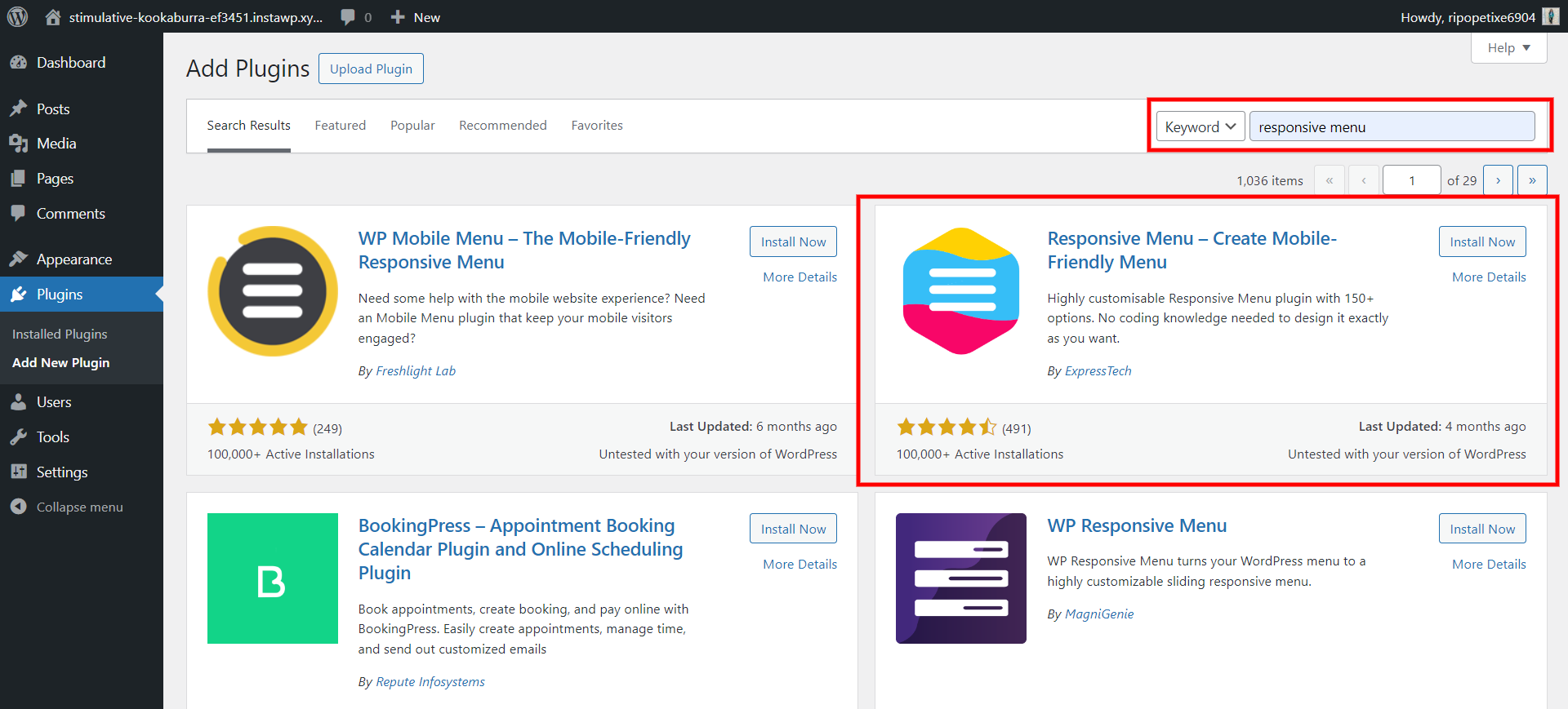
In the search bar, search for the ‘Responsive Menu’ plugin. Once done with the installation, don’t forget to activate the plugin. You can either download the plugin directly from the dashboard or get it from the Official website.
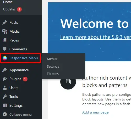
Once you successfully install and activate the plugin, you will see the “Responsive Menu” option on the left sidebar of the page.
Want to create an image gallery for your WordPress website? Read Creating An Image Gallery in WordPress – 5 min Simplified Guide
Step 2: Create a Responsive WordPress Navigation Bar
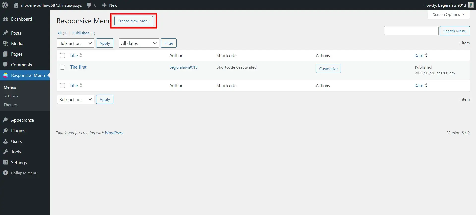
The next step to create a responsive WordPress navigation bar is to create a navigation menu. For that, navigate the Responsive Menu >>> Menus option on the sidebar of the WordPress dashboard.
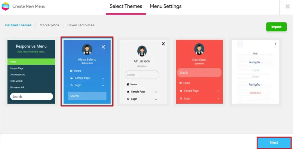
Now, select on ‘Create New Menu’ button to create a new menu. Select the theme you like. All these provided by the plugin are super responsive. You can also import the theme from the ‘Import’ button on the top right side of the menu.
Now, click on the ‘Next’ button on the bottom right side of the interface. Here, you will land on the ‘Menu Settings’ tab. Fill in the necessary details like naming your menu, linking it to the WordPress Menu, hiding the theme menu, and more.
The most important thing to consider while creating a responsive WordPress navigation bar is to make sure that you check on the ‘Mobile’ option in the ‘Device Visibility’. This will let your website be responsive to all mobile devices.
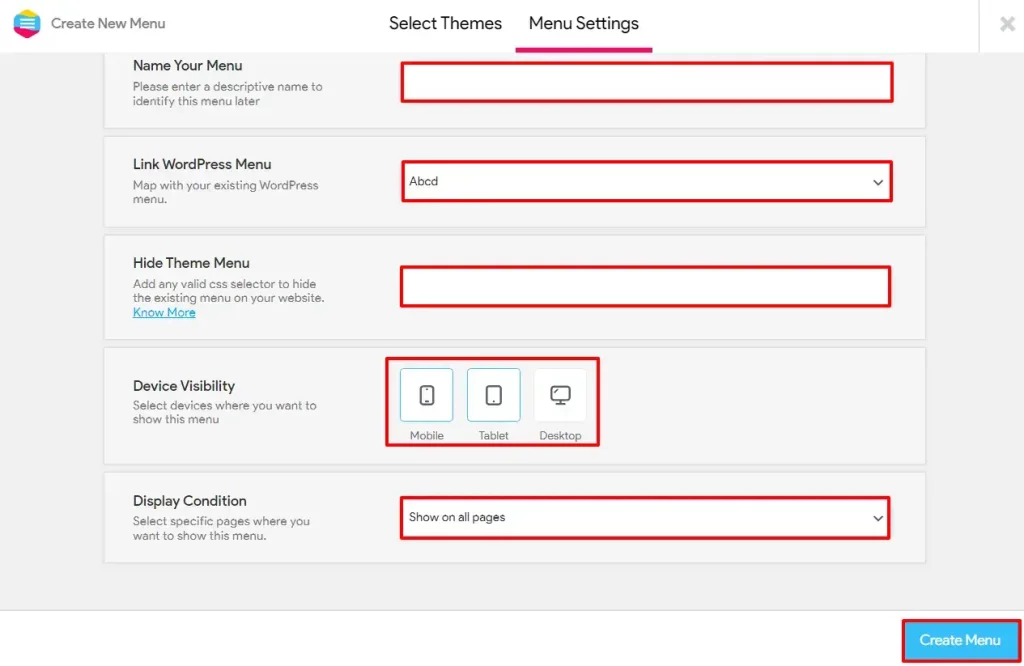
Once done with the customization, click on the ‘Create Menu’ option.
Step 3: Create a WordPress Mobile Menu
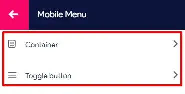
When you click on the Mobile Menu option, you can see the Container and Toggle button options. In the Container’s Title’s Content section, you can define Title Text, Link, Link Target and Upload Image. Also, change the Font settings according to your taste.
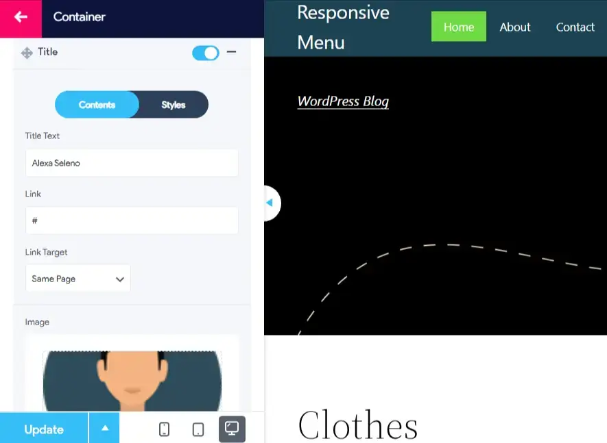
Turning next to the Styles section, set up Padding, Background, Background Hover Color, Font Size, Text Alignments, Font Weight, and Font Family. Also, specify Text Color and Text Hover; Image Width, and Image Height. After making these adjustments, be sure to click the Update button. This Additional Content can have its style modifications.
Struggling to log into WordPress admin? Read How to Log Into WordPress Admin? 2 Easy Approaches.
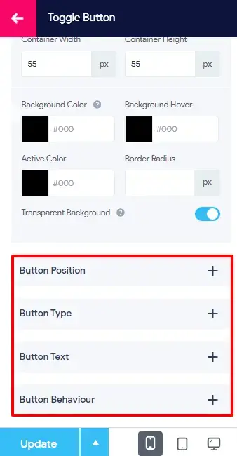
According to your preferences, adjust the settings in the Toggle Button: Container Width, Container Height, Background Color, Background Hover, Active Color; Border Radius and enable or disable Transparent Background. Finally, customize Button Position, Button Type, Button Text, and Button Behavior to complete the individualization of your Responsive Navigation Menu in WordPress.
Considering Everything
If your navigation menu doesn’t work on a mobile phone, most of your audience will find it difficult to navigate your website. This will make your user experience complex and might lead to the users leaving your website. The ability to seamlessly navigate across devices is a cornerstone of modern web design, and with these insights, you’re well-equipped to make your site not only visually appealing but also highly functional.
A responsive WordPress Navigation Bar makes sure that it fits all screen sizes without affecting its functionality. This helps your users to find their way around the website.
If you like reading this blog, do read How to Integrate ChatGPT Into the WordPress Website? (4 Easy Steps), Setting Up FrontPage And Post Page – Best Explained in 5 mins and How to Add a Terms of Service Checkbox With Gutena Forms? (4 Simple Steps).


Stuck Somewhere?
Connect With JustHyre
Hire WordPress Engineers for custom jobs like Website Customization, SEO Optimization, Clearing a Hacked Website, Installation & Configuration & more.
Connnect with JustHyre
0 Comments