How to Add a Hamburger Menu in WordPress? (6 Easy Step Guide)
Hamburger menu… The name might make you hungry, but it has nothing to do with food. If you use a mobile device or spend time on the internet browsing different websites, you must have come across lots of sites using the hamburger menu button. They are the navigation buttons with three lines that give you access to other menu pages.
Since the menu is the first of the few things that your visitors see when they land on your homepage, it is important to keep your webpage clean. The hamburger menu is an efficient way to put navigation options into a smaller space keeping the interface clutter-free.
Read this blog to learn more about the hamburger menu and how you can easily create a hamburger menu in WordPress. We have also listed the WordPress plugins using which you can easily create a hamburger menu.
What Is the Hamburger Menu?
A hamburger menu or a hamburger icon is a navigation button that opens to a side menu or navigation drawer. It is a navigation element that you can easily find on various websites, apps, and programs.
Its delicious and mouth-watering name comes from its design. Since a hamburger menu button comprises three horizontal lines, it resembles a hamburger.
A hamburger menu button helps your website layouts look cleaner and easier to navigate while taking up less space. It is usually placed in the top corner of the interface. The main purpose of the hamburger menu button is to save screen space by hiding navigational elements.

Pros of the Hamburger Menu
1. They Take Up Less Space
The most common and the most popular reason why the hamburger menu is still in existence is that they take up less space. Since, while creating a website, it is a difficult task to provide all the information in a small amount of space, the hamburger menu is a savior.
2. It’s Clean
Is anything worse than a messy and tortuous webpage?
Most users and designers prefer the minimalist design of a webpage. They prefer only the necessary elements required for information and communication. A minimalist aesthetic webpage offers more functionality and shows credibility. And that is where, a hamburger menu, a clean way for navigation, comes into play as it cuts down on how much visitors have to process when taking in your webpage at a glance.
3. Less Clutter
If you have a simple website with just three pages, it won’t be difficult for you to include them all in the main menu on the desktop. But when you plan to add more pages and different categories to the website, figuring out how to show them all to the users without overwhelming them can be a design challenge. An overly messed up and complex webpage can end up distracting users from the main purpose.
A hamburger menu makes sure that a user finds the full list of categories while keeping the design of the webpage clean and paying attention to the product you want them to focus on.
4. It Is Recognizable
A hamburger menu has been found everywhere from apps to websites to programs. A hamburger menu is a functional element that is intuitive to users who use smartphones on an everyday basis or spend enough time online to get used to common design elements. For decades it has been embedding itself in social consciousness as the button where users can access the navigation drawer.
5. Secondary Access
The hamburger menu usually replaces a website’s main menu. But it’s not the case on every website. Some website owners might keep a hamburger menu alongside the main menu. The hamburger menu is secondary access, removing distractions without losing functionality.
Responsive Menu Plugin
Responsive Menu is an amazing WordPress plugin, which is also your one-stop destination with all the features you need to create a beautiful WordPress Responsive Hamburger Menu. Responsive Menu helps you create beautiful and responsive menus for your WordPress website. Responsive Menu also has its pro version with features like 20+ button animations, 600+ font icons, touch gestures and keyboard commands, and much more.
Create a Hamburger Menu With the Responsive Menu Plugin
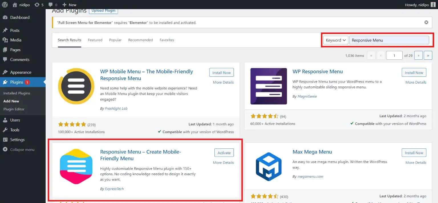
Step 1: Install the Plugin
Go to the WordPress dashboard and find “Plugins”. There, go to the search field and search for the “Responsive Menu” plugin. Download the plugin published by ExpressTech and activate it.
Step 2: Go to the Responsive Menu
After activating the plugin, you will find the “Responsive Menu” option in the menubar of your WordPress dashboard.
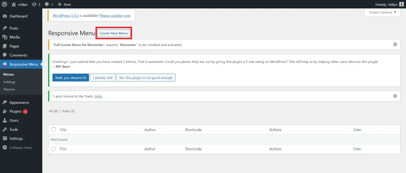
Click on it and then click on “Create New Menu” to create a responsive menu for your WordPress website. Now, you will first have to select the theme for your menu and then will have to fill in a few fields like naming the menu, which WordPress menu to link, and a few more.
Step 3: Customize the Responsive Menu
After creating a Responsive Menu for your WordPress website, you will find various options to customize it.
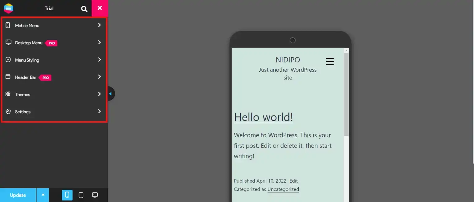
From the “Mobile Menu” option, you get access to customize “Container” and “Toggle Button”. In the “Container” option, you get two tabs. From the “Content” tab, you get access to customize the title, add links, edit images, and set font icons. From the “Styles” tab, you get access to style your Responsive Hamburger Menu with options like padding, background, font size, font weight, and much more.
From the “Toggle Button”, you can customize the toggle button with features like width, height, background color, and more. You can also style your responsive Hamburger menu from “Menu Style”. Try various other options available and customize the Hamburger menu in a way that inclines toward your design.
Why Use the Responsive Menu Plugin?
- Highly customizable: With a Responsive menu, you can customize your Hamburger menu with various options. This plugin allows you to control and customize menus on mobile, tablet, and desktop devices.
- More button animations: The plugin offers you 20+ button animations for your website to look more cool and sophisticated.
- Amazing font icons: As mentioned earlier, the Responsive Menu has 600+ amazing font icons. You can choose one that goes with the theme of your website.
- Quality touch gesture and Keyboard command: The responsive menu lets you use hand and mouse-controlled touch gestures and keyboard commands like Esc and Space to open and close the menu.
- Custom CSS: Custom CSS allows you to edit the menu as per your requirement, without editing any theme files.
- Pro Version: Responsive Menu Pro has premium features for you to create an engaging Hamburger Menu.
Other Top Hamburger Menu Navigation WordPress Plugins
1. Navi
Navi impresses with its smooth look and lightness. It has many features of customization that can allow you to adjust colors, opacities, and menu button animations to suit your website’s design. Great for those looking for lightweight customization without sacrificing style.
2. Superfly Menu
The Superfly shines when it comes to the design responsiveness and the implementation of the hamburger menu buttons that are easy to control for both desktop users and mobile users. The rich-text editor offers the possibility to add custom content or shortcodes, providing adjustability. Very well suited for websites that need wide content integration within menus.
3. Morph
The main idea of Morph is to work perfectly on both mobile menus and desktops or touch screens. This tool has an intuitive interface and more than 70 custom options that make clear and beautifully animated designs for your webpage. On the other hand, it is especially useful when designing for mobile.
4. Tactile
Tactile is particularly adept at optimizing browsing on smaller screens such as on smartphone devices. The ease of use is ensured by its simple design, and the customization features like color choice, background header image addition, and more allow usability to be optimized. Particularly made for mobile interaction that is seamless.
5. AirMenu
AirMenu is a user-friendly, easy-to-install WordPress menu plugin with high customization possibilities. It highlights responsive design making it a perfect match for several website projects. Suggested for the individual looking for a quick installation and customization without having to impair the responsiveness.
SEO and Accesibility Tips
The hamburger menu can also help you in optimizing the SEO. Additionally you you can make your website accessible to users with disabilities by properly crafting the hamburger menu. To do so:
- Use descriptive text or labels for the hamburger menu icon.
- Employ semantic HTML markup for menu structure.
- Avoid hiding critical navigation links within the hamburger menu.
- Provide descriptive alt text for the hamburger menu icon.
- Ensure keyboard navigation functionality for opening and closing the menu.
- Implement ARIA attributes to enhance accessibility.
- Regularly test your website’s accessibility using tools like WAVE or Lighthouse Accessibility audits.
Wrapping Up
And that is all for this blog. We hope that our guide has helped you in creating an amazing hamburger menu for your website. There are several benefits of using the hamburger menu which we have already discussed above. We have also shown you a simple way to create a hamburger menu for your website.
Every website is different and what works for your website depends on your unique situation. If you want to go the extra mile and want to create a more esthetic and advanced hamburger menu for better engagement of your website, we have also covered a list of useful plugins.
If you like reading this blog, also read our step-by-step guide on How to import and easily export WordPress users. (Exporting WordPress users within 5 minutes) and How to Create an Engaging FAQ Section Using Elementor? (5 Easy Steps)
[wbcr_html_snippet id=”4204″]
FAQs
1. How do I add a hamburger menu to my Elementor WordPress?
To add a hamburger menu to your Elementor WordPress website, you can utilize the Responsive Menu plugin. Install and activate the plugin, then configure your menu settings through the Responsive Menu dashboard. Once set up, you can easily integrate the hamburger menu into your Elementor design by adding a custom widget or shortcode provided by the Responsive Menu plugin.
2. How do I add a custom menu in WordPress?
First, navigate to the WordPress dashboard and go to “Appearance” > “Menus”. Create a new menu, give it a name, and add to it your preferred pages, categories, or custom links. Once you’ve customized your menu, save it, and then assign it to a location (such as the primary navigation menu) by choosing the necessary option in the menu settings.
3. What is the meaning of hamburger in WordPress?
The hamburger menu is denoted as three horizontal lines positioned on top of each other. This symbol is usually found as a navigation button, especially on mobile devices, to display the menu or a navigation drawer by clicking it. The word “hamburger” was shaped because of that icon’s likeness to a hamburger sandwich.
4. How do I add a navigation menu in WordPress?
To add a navigation menu in WordPress, go to the WordPress dashboard and select “Appearance” > “Menus”. Then create a new menu or select an existing one, adding pages, categories, or custom links to it. Personalize the menu architecture and order as desired. Then, assign the menu to a place on your website, probably the primary navigation menu, by choosing the right option in the menu settings.


Stuck Somewhere?
Connect With JustHyre
Hire WordPress Engineers for custom jobs like Website Customization, SEO Optimization, Clearing a Hacked Website, Installation & Configuration & more.
Connnect with JustHyre
0 Comments