How to Create Responsive Tables in WordPress? (2 Different Ways)
Struggling to add responsive tables in WordPress?
Tables are used to display lots of data in a way that makes it easier for users to understand. However, setting up a responsive table sometimes proves tricky as it needs to be compatible with all kinds of devices, be it orthodox computer screens or smartphones.
That’s where responsive tables come into the picture. Responsive tables have the amazing feature of adjusting themselves according to the device size, resulting in an optimal view.
Don’t worry! Here we are to assist with setting up responsive tables in WordPress. Let’s create dynamic tables in WordPress.
Understanding Responsive Table
Responsive tables are a crucial part of the website, as they provide the content’s overall summary saving a lot of time on the user end. It also helps the website’s owner to keep the website better functioning.
Usually, a beginner faces many challenges in setting up dynamic, adaptive, and responsive tables in WordPress. If it is not done, then whenever a user changes screen size, the table’s structure gets distorted, changing the size of rows and columns, spilling the content out of boxes, changes in fonts, etc., and ultimately giving an unpleasant user experience.
When you set up a responsive table, you are programming or instructing your original tables of content to readjust and provide a suitable fit in the screen output. There are two methods to create a responsive table: using a plugin in the website and without a plugin.
Let’s Begin With Plugins!
Using a plugin saves time as you don’t have to worry about writing CSS code. Plugins take care of it by themselves, enabling you to develop a responsive table more simply.
Your first step would be to choose a plugin for your website. There are a lot of plugins available currently with free/premium versions. Read the following steps to create responsive tables in WordPress using plugins.
Go to the Plugins in the sidebar of WordPress, and search for the responsive table plugin. Install it and activate it by clicking on the “Activate” button. Once you are done with the installation, you can set up the table from scratch as per your requirements.
Most of the plugins also provide a second option to import your ready-made table directly, and then you can customize it according to your design. After completing the essential content and formatting -column’s header name, type of data, number of rows and columns, and structure – set your responsive table breakpoint.
The breakpoint in a responsive design refers to when a site’s design and content change so that a user has the best possible experience. Now you are ready to test your responsive table on various screen sizes such as a tablet, laptop, mobile, etc. If you still find your table incompetent, you just need to readjust your breakpoints.

Top Responsive Tables Plugin in WordPress
WordPress is loaded with feature-rich responsive table plugins. Each plugin has different features to meet its user’s requirements. The top 3 WordPress table plugins are listed below.
1. Ninja Tables
Ninja Table is one of the most popular plugins that can make tables responsive. Its user-friendly interface makes it much easier for its users to create dynamic tabes for their WordPress website. One amazing feature of the plugin is that it doesn’t need any add-ons to make your tables fully responsive as the plugin can create tables that would adjust according to the user’s screen.
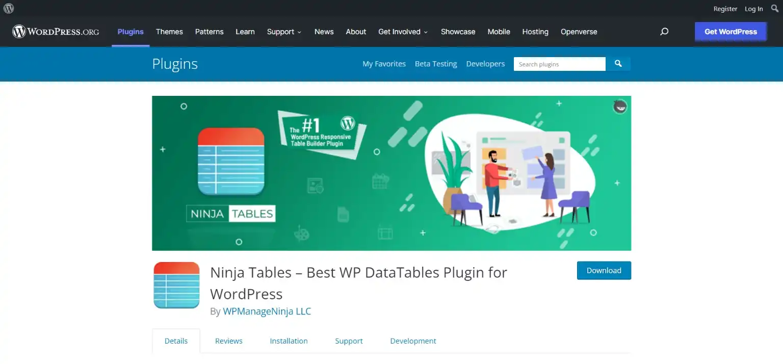
Apart from this, it also has amazing features like easy sorting and filtering data in tables, importing/exporting tables from another website, duplicate tables in click, easy integration with Google Sheets and WooCommerce, and table customization like giving borders and changing colors.
2. TablePress
With features like HTML support inside the table and shortcodes which makes it super easy to add tables anywhere on the WordPress website, TablePress is one the most widely used and top-rated WordPress responsive table plugin. You can easily sort your tables and break them into different pages, using this plugin.
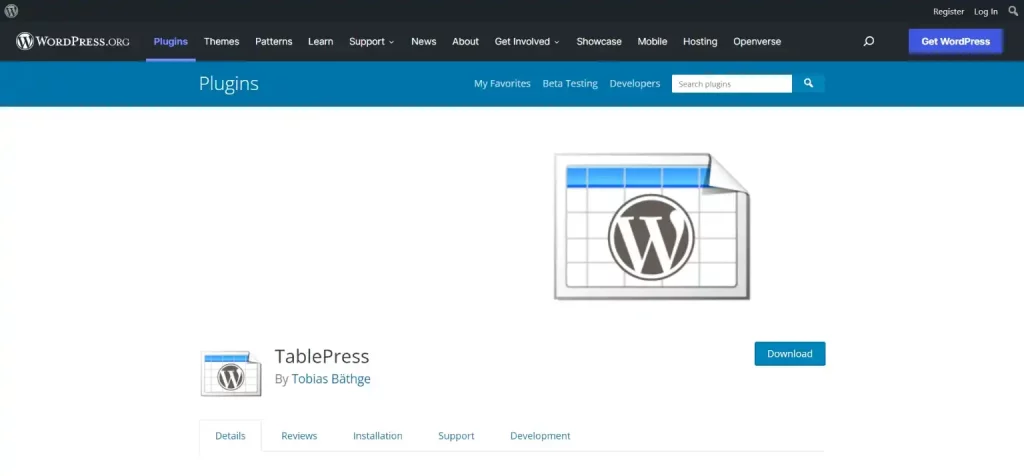
If you want to export your tables to Excel, CSV, and PDF, or import your tables from, Google Sheets, CSV, and Excel, TablePress makes it very simple and easy with its user-friendly interface.
3. wpDataTables
If you don’t use tables very frequently, then this WordPress responsive table plugin will work for you. It can create simple-looking tables for your WordPress website. You can easily customize your table by merging cells, font family, font size, and color adding media, custom links, and changing borders.
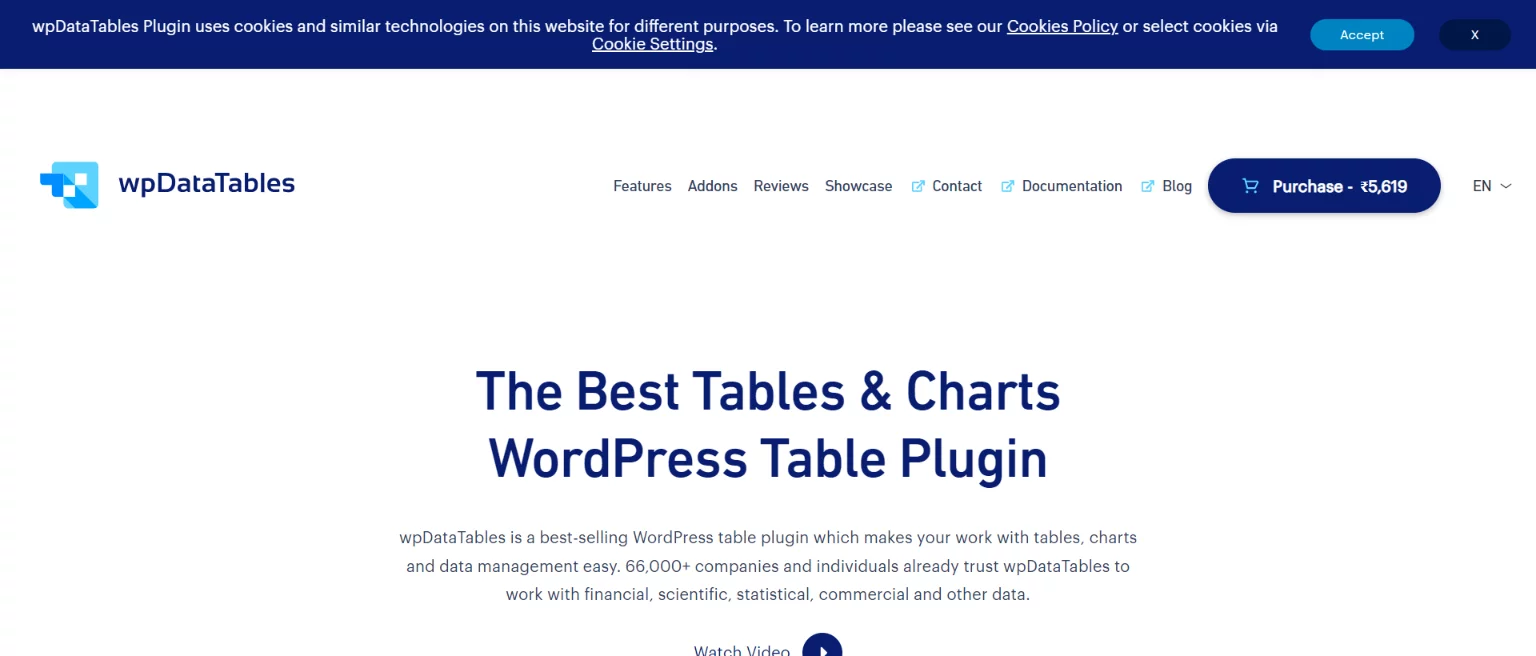
It is not the best WordPress responsive table plugin, but if you don’t use tables very frequently, then that plugin can work for you. It can create huge responsive tables in minutes and has an advanced filter and search option.
Responsive Tables Without Plugins
It is a tedious task to make a responsive table for a layman without a basic knowledge of programming languages and codes. Thus without a plugin method works best for developers with coding experience, specifically with a grasp of Cascading Style Sheets (CSS) and HTML. It is always best to work on the code on your learning platform before trying it on a live website.
Using code, you can directly make changes in the code of the table, from adding a scroll bar to grouping data. Follow the below-mentioned steps to create responsive tables in WordPress without plugins:
- On WordPress, begin with creating a new page or post.
- Next, click the “+” icon in the top bar. Find and click on the specific Custom HTML block after that. Then, you can enter your HTML code inside the specific HTML block. It would help if you used the <table> tag to construct the HTML table where the data cells are created using the <td> tag and the table rows are made using the <td> tag.
Note that the items in the <td> tag are all regular and default to being aligned to the left.
- Also, set your breakpoint in the code so that whenever there is a change in the screen ratio, it will fit the screen.
- Lastly, with WordPress’s handy built-in screen test tool, you may test your content on three different screen sizes.
- If you have already written code, you can just paste it after opening the HTML block. Once you publish your code, you can see all the effects.
Wrapping Things Up
And this is how you can easily add responsive tables in WordPress. This was a simplified guide on how you can create responsive tables in WordPress, but if you still have any problems or if you get stuck somewhere, you can hire WordPress engineers from JustHyre. Using responsive tables in WordPress can lead to a better user experience and can drive more organic traffic to your website.
If you like reading this blog, also read our step-by-step guide on How to Add a Surprising WordPress Background Image in 5 Minutes. (Easy Methods) and our experts pick on How to Fix a Slow WordPress Admin Dashboard? (10 Different Ways).


Stuck Somewhere?
Connect With JustHyre
Hire WordPress Engineers for custom jobs like Website Customization, SEO Optimization, Clearing a Hacked Website, Installation & Configuration & more.
Connnect with JustHyre
0 Comments